Case Study / Circonus / 2020
Circonus Observability Product & Brand.
Product UI and marketing design for an observability platform used by SREs, DevOps teams, data scientists, and technical operations teams.
Circonus is a monitoring and observability solution used by data scientists, Site Reliability Engineers, and technical operations teams to understand and predict IT system health.
The role sat between product and marketing, with practical ownership across dashboard UI modernization, digital brand systems, and go-to-market design.
I was hired as Senior Designer to work across product and marketing. The brief was broad: modernize a dense data visualization interface, extend the brand into a stronger digital system, and create materials that helped technical buyers understand the platform.
- User Interviews
- Accessibility Reviews
- Stakeholder Interviews
- A/B Testing
- SEO
- Google Analytics
- WordPress
- Bootstrap
01 · Product
Data visualization UI for observability workflows.
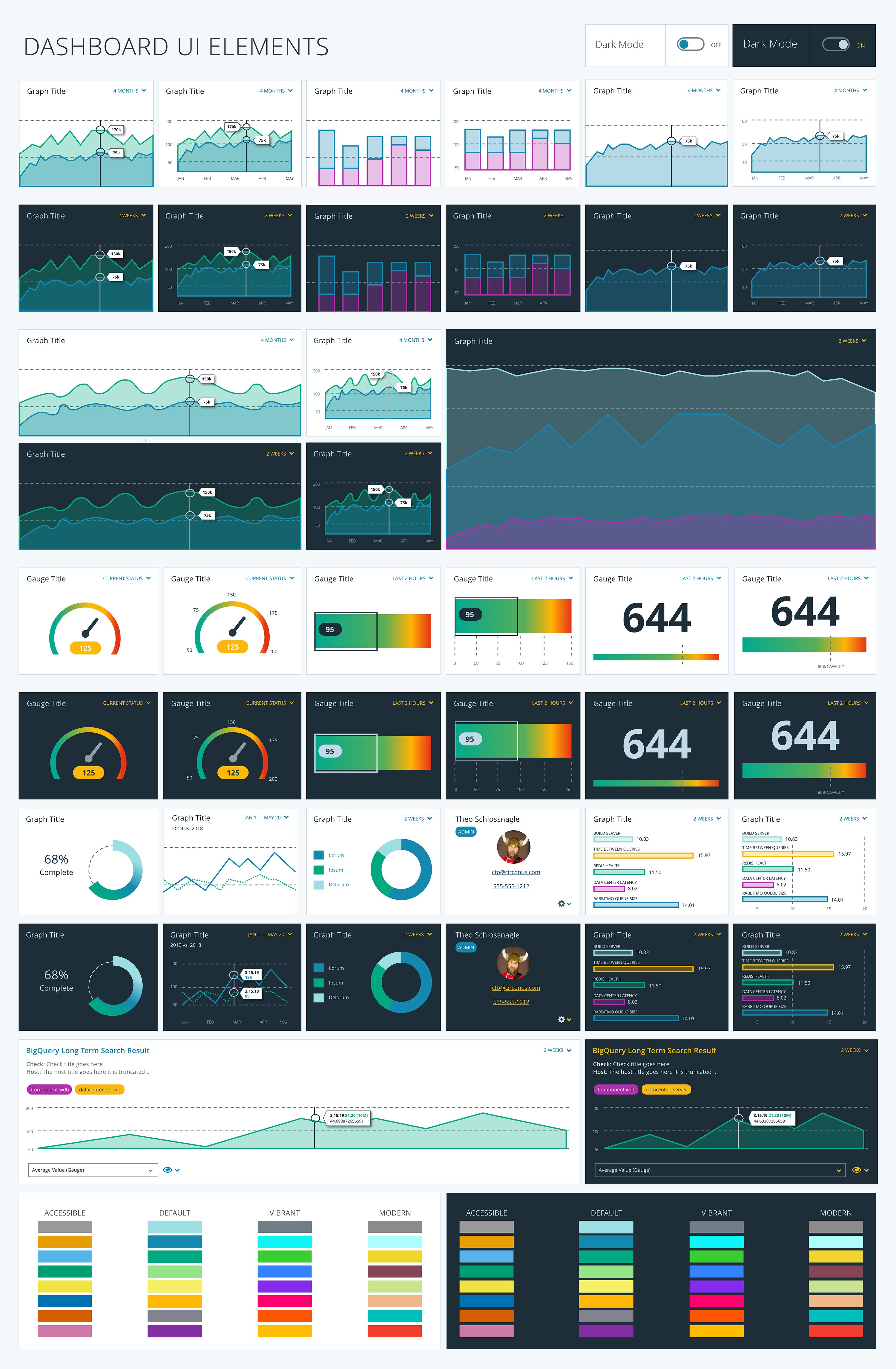
The product work focused on updating and modernizing the dashboard experience for deeply technical users. In observability tools, interface clarity is operationally important: teams need to scan system state, find patterns, and move toward root cause without fighting the UI.
The redesign emphasized clearer presentation, stronger hierarchy, accessible color palettes for color-blind users, and more disciplined component patterns for SRE, DevOps, and analyst workflows.
- Dense metrics and system-health views
- Clearer scan paths for technical users
- Color-blind accessible palettes
- Reusable dashboard UI components
Design principle 01
Make system health easier to scan.
Dense information can work when hierarchy, labels, and interaction patterns stay disciplined.
Design principle 02
Design color as a support, not a crutch.
Palette and component choices needed to support color-blind accessibility while preserving the precision expected by technical users.
02 · Digital Brand
Website, blog, and brand system.
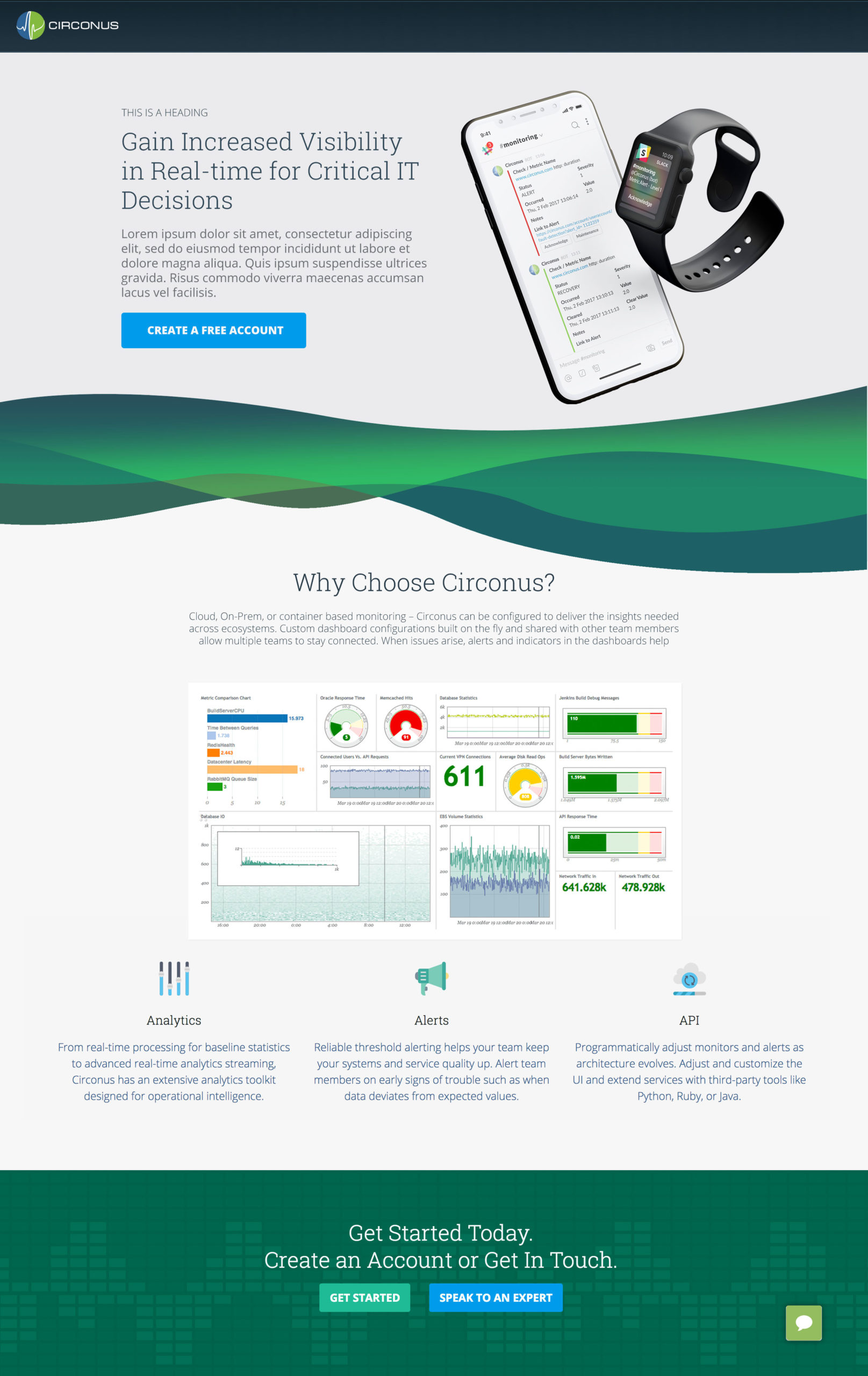
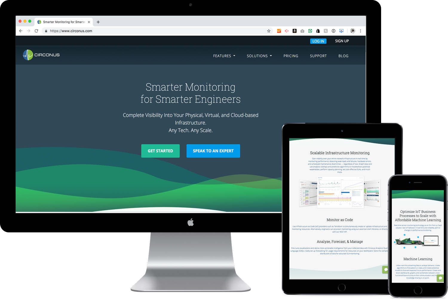
I redesigned Circonus.com from the ground up using WordPress and Bootstrap to create a custom theme that could support product storytelling, technical content, and marketing campaigns.
The blog was also redesigned with custom PHP to display posts and create relational suggested reading, helping visitors move through deeper technical content instead of landing on isolated articles.
- Custom WordPress/Bootstrap theme
- Blog redesign and related reading
- SEO and analytics instrumentation
- Reusable landing-page patterns
03 · Go To Market
Campaign and collateral system.
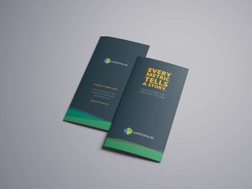
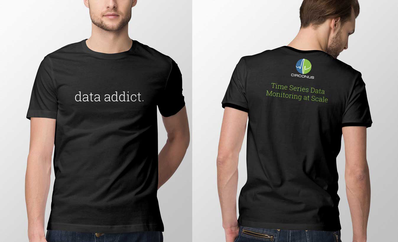
Alongside product and website work, I designed campaign materials to support adoption, lead generation, sales conversations, and conference presence.
The collateral system translated Circonus into formats a technical sales team could use repeatedly: banner ads, targeted landing pages, email campaign templates, brochures, conference swag, and sales-support materials.
Outcomes
What changed.
data visualization
tracking setup
theme build
sales and events